省略号
纯 CSS 检测文本是否溢出
基础模式
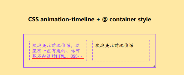
<h3>CSS animation-timeline + @ container style</h3>
<div class="con">
  <div class="txt">
    欢迎关注前端侦探,这里有一些有趣的、你可能不知道的HTML、CSS、JS小技巧技巧。欢迎关注前端侦探,这里有一些有趣的、你可能不知道的HTML、CSS、JS小技巧技巧。
  </div>
  <div class="txt">
    欢迎关注前端侦探
  </div>
</div>
html,body{
  font-family: -apple-system, "BlinkMacSystemFont", sans-serif;
  margin: 0;
  height: 100%;
  display: flex;
  justify-content: center;
  flex-direction: column;
  align-items: center;
  background: #FFE8A3;
  gap: 20px;
}
.con{
  display: flex;
  justify-content: center;
  /* flex-direction: column; */
  gap: 20px;
  padding: 20px;
  width: 400px;
  outline: 2px solid #9747FF;
  overflow: hidden;
  resize: horizontal;
}


/* 以下为本demo */
.txt{
  position: relative;
  flex: 1;
  display: -webkit-box;
  -webkit-box-orient: vertical;
  -webkit-line-clamp: 3;
  overflow: hidden;
  border: 8px solid transparent;
/*   height: 4em; */
/*   padding: 8px; */
  outline: 1px dashed #9747FF;
  font-family: cursive;
  border-radius: 4px;
  --trunk: false;
  animation: check 1s;
  animation-timeline: scroll(self);
}
@keyframes check{
  from, to {
    --trunk: true;
    color: #9747FF;
  }
}
@container style(--trunk: true) {
  .txt::after{
    content: '';
    position: absolute;
    inset: 0px;
    border: 1px solid red;
  }
}
按钮模式
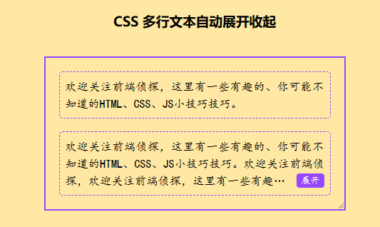
<h3>CSS 多行文本自动展开收起</h3>
<div class="con">
  <div class="text-wrap">
    <div class="text-content">
      <label class="expand"><input type="checkbox" hidden></label>
      欢迎关注前端侦探,这里有一些有趣的、你可能不知道的HTML、CSS、JS小技巧技巧。
    </div>
  </div>
  <div class="text-wrap">
    <div class="text-content">
      <label class="expand"><input type="checkbox" hidden></label>
      欢迎关注前端侦探,这里有一些有趣的、你可能不知道的HTML、CSS、JS小技巧技巧。欢迎关注前端侦探,欢迎关注前端侦探,这里有一些有趣的、你可能不知道的HTML、CSS、JS小技巧技巧。
    </div>
  </div>
</div>
html,body{
  font-family: -apple-system, "BlinkMacSystemFont", sans-serif;
  margin: 0;
  height: 100%;
  display: flex;
  justify-content: center;
  flex-direction: column;
  align-items: center;
  background: #FFE8A3;
  gap: 20px;
}
.con{
  display: flex;
  justify-content: center;
  flex-direction: column;
  gap: 20px;
  padding: 20px;
  width: 300px;
  outline: 2px solid #9747FF;
  overflow: hidden;
  resize: horizontal;
}
.text-wrap{
  display: flex;
  position: relative;
  padding: 8px;
  outline: 1px dashed #9747FF;
  border-radius: 4px;
  line-height: 1.5;
  text-align: justify;
  font-family: cursive;
}
.expand{
  font-size: 80%;
  line-height: 20px;
  padding: 0 .5em;
  background-color: #9747FF;
  color: #fff;
  border-radius: 4px;
  cursor: pointer;
  float: right;
  clear: both;
  display: none;
}
.expand::after{
  content: '展开';
}
.text-content{
  display: -webkit-box;
  -webkit-box-orient: vertical;
  -webkit-line-clamp: 3;
  overflow: hidden;
  --trunk: false;
  animation: check 1s;
  animation-timeline: scroll(self);
}
.text-content::before{
  content: '';
  float: right;
  height: calc(100% - 22px);
}
.text-wrap:has(:checked) .text-content{
  -webkit-line-clamp: 999;
}
.text-wrap:has(:checked) .expand::after{
  content: '收起';
}
.text-wrap:has(:checked) .expand{
  display: initial;
}


/* 以下为本demo */
@keyframes check{
  from,to {
    --trunk: true;
  }
}
@container style(--trunk: true) {
  .expand{
    display: initial;
  }
}
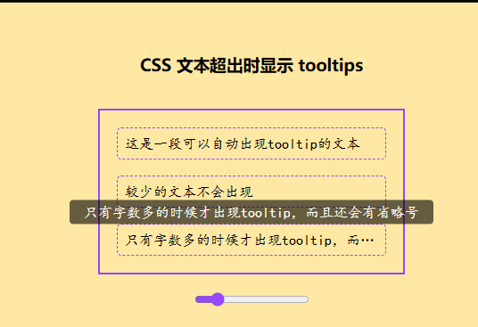
<h3>CSS 文本超出时显示 tooltips</h3>
<div class="con">
  <div class="wrap">
    <div class="txt" data-title="这是一段可以自动出现tooltip的文本">
      这是一段可以自动出现tooltip的文本
    </div>
  </div>
  <div class="wrap">
    <div class="txt" data-title="较少的文本不会出现">
      较少的文本不会出现
    </div>
  </div>
  <div class="wrap">
    <div class="txt" data-title="只有字数多的时候才出现tooltip,而且还会有省略号">
      只有字数多的时候才出现tooltip,而且还会有省略号
    </div>
  </div>
</div>
<input type="range" min="200" value="300" max="800" oninput="this.previousElementSibling.style.width = this.value + 'px'">
html,body{
  font-family: -apple-system, "BlinkMacSystemFont", sans-serif;
  margin: 0;
  height: 100%;
  display: flex;
  justify-content: center;
  flex-direction: column;
  align-items: center;
  background: #FFE8A3;
  gap: 20px;
  accent-color: #9747FF;
}
.con{
  display: flex;
  justify-content: center;
  flex-direction: column;
  gap: 20px;
  padding: 20px;
  width: 300px;
  outline: 2px solid #9747FF;
  /* overflow: hidden; */
  resize: horizontal;
}

/* 以下为本demo */
.txt{
  overflow: hidden;
  white-space: nowrap;
  text-overflow: ellipsis;
  padding: 8px;
  outline: 1px dashed #9747FF;
  font-family: cursive;
  border-radius: 4px;
  --trunk: false;
  animation: check 1s;
  animation-timeline: scroll(x self);
}
.wrap{
  position: relative;
}
@keyframes check{
  from,to {
    --trunk: true;
  }
}
@keyframes move{
  to {
    transform: translateX(-50%);
  }
}
@container style(--trunk: true) {
  .txt::after{
    content: attr(data-title);
    position: absolute;
    top: 0;
    width: fit-content;
    left: 50%;
    margin: auto;
    transform: translate(-50%,-100%);
    background-color: rgba(0,0,0,.6);
    padding: .3em 1em;
    border-radius: 4px;
    color: #fff;
    opacity: 0;
    visibility: hidden;
    transition: .2s .1s;
  }
  .txt:hover::after{
    cursor: default;
    opacity: 1;
    visibility: visible;
  }
}